

The arrival of the Motorola Xoom also meant the arrival of the tablet-specific Android named Honeycomb. Having said that previous versions of Android weren’t really meant for tablets, what should we expect from this version that aims to bring the tablet experience further? Significant changes will definitely include UI updates that will utilize the larger touchscreens that tablets have (and smartphones don’t). So what’s more to come? Stick in and find out.

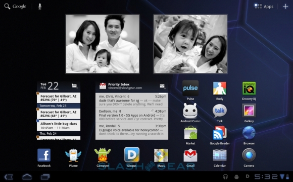
Let’s start with the all apparent changes in terms of the appearance. The main desktop would consist of 5 scrollable panes, each capable to fit 56 icons through an 8×7 icon grid. In line with the cosmetic changes is the disappearance of the usual hardware buttons that Android devices have. They’re replaced by on-screen control icons on the Action Bar located on the top of the screen as well as the System Bar at the button. The action bar icons change depending on what application is currently active. This would bring custom control to any application available — with the default being a Google Search button and a Voice Actions trigger as seen in the desktop. The main replacement for the hardware buttons are located in the System Bar at the button which has the “Back”, “Home” and “App Switcher” buttons on the left hand while status icons on the right. Tapping on the System Bar will reveal a pane showing more detailed information on the icons there, like the current wireless network configuration, volume settings among others. Honeycomb also put emphasis on the on-screen notifications through the utilization of the provided screen space.
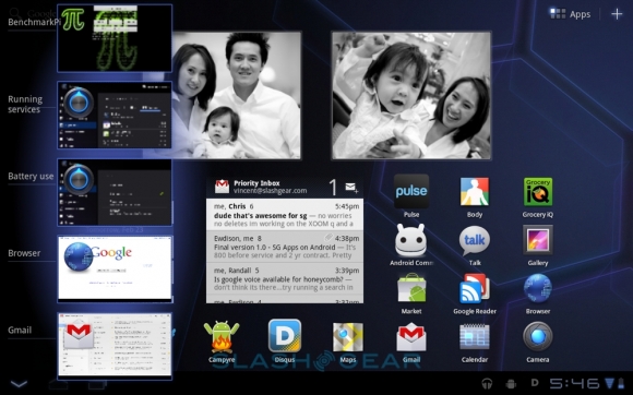
Google has made multitasking a key element to the Honeycomb upgrade, and an evidence of this is their improved App Switcher. Simply tap its button on the System Bar and it will display 5 previews at a time of active apps, and just scroll through them to see more. Now this is what Google claims as true multitasking in every sense of the word.

Text entries are made through the new on-screen keyboard as shown above. It’s not as cluttered as before through placing the number keys as a secondary keyboard layout. Also, these keys vary depending on what type of application is currently active. So for browsers as example, there would be a dedicated “.com” key or emoticons for those online chats. Taking advantage of its multitap feature means that you can just hold on to the shift key like in a regular keyboard and type in any letter to get it to upper case.

Voice Actions work the same way as those in Android smartphones. As such, the same vocal commands are usable to trigger the same functionalities — like “Navigate to…” plus a location and Google Maps with automatically locate it for you.

Overall, the changes in the user interface are apparent in the overall theme as some may say that this is inspired from Tron or something with the electric blue colors used in the angular design elements as well as color highlights for the icons and such. One key feature is the overall cohesiveness and consistency of the panes, apps, etc. The animations are kept to where they’re needed and doesn’t give any impression of any discrepancy in response.

We all know that for the most part, tablets like the Xoom are going to be used for web browsing. Thus it is important that they make it a great experience… so do they? For one, Honeycomb’s included a fast browser and add to that the Tegra 2 processor for the Xoom makes surfing very efficient by rendering pages fast. Now if you’ve been using for quite a while and you wanted that “Incognito” feature included, then you’re in luck. The included browser allows you to surf privately with no data being saved. Other options include automatic syncing of your bookrmarks to those in Chrome and automatic signing in to Google pages/services.

For browser controls, you can use finger-gestures by swiping to either left or right to mimic the back and forward functions.
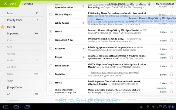
Email in Honeycomb is handled two ways. You can either use the built-in app that has support for POP, IMAP, & Enchange. If you have a Gmail account, then you can opt to use the dedicated Gmail app that allows you to push messages, add labels and have multiple accounts. Then there’s the expected drag and drop of mails to folders that comes in very handy. Messaging for the OS comes through Google Talk as you can use it to make VoIP calls as well as instant messaging. If you have a Xoom, then this is the only means you can make calls as Verizon offers the tablet on a data-only contract. You can then take advantage of the front-view camera when making the said calls .

While on the subject, let’s focus on the camera-related functionality of Honeycomb. Google has made a refresh over the interface as well as the controls. The screen will bring up a huge preview pane on the left side while all controls are neatly placed on the right hand side. Clearly noticeable is a circular-wheel interface with the shutter on the center. Effects on the ring include scene, focus and others. You get the usual camera controls and settings placed there. Browsing the taken pictures and videos are made better thanks to the updated gallery. Tapping on a single image will blow up the selected picture and will show other images with respect to the selected one in a timeline display at the bottom. You can scroll through them to select the next picture to view. The action bar at the top changes to suit the gallery and allows a slideshow view, as well as image sharing through email.

If Google learned one thing from the competition (i.e. Apple) it is to make a great music application for their mobile OS — and they didn’t disappoint with Honeycomb. You’re presented with a wall of albums that you can flip, rotate, twist and of course, scroll to play the song you like. If you get dizzy with that view, then you can change it to the playlist view that displays the songs in whatever order you want. Playing tracks will blow up the album cover with a seek bar and the usual controls on the bottom of the screen. As for video, you’re presented with either a grid or list of available clips to view and playback is basically the same with the audio tracks. Video support for Honeycomb include H.263, H.264, MPEG-4 and VP8, in .3gp, .mp4 and WebM containers. If that’s lacking to your taste, you can always download additional players in the Android Market to fill in the gaps.

Given the current lack of Flash support (current as Adobe is preparing one), the only way you can view YouTube videos is through the dedicated app that also underwent changes over the previous versions. Like the music player, you’re shown a wall of videos you can select the ones to view.
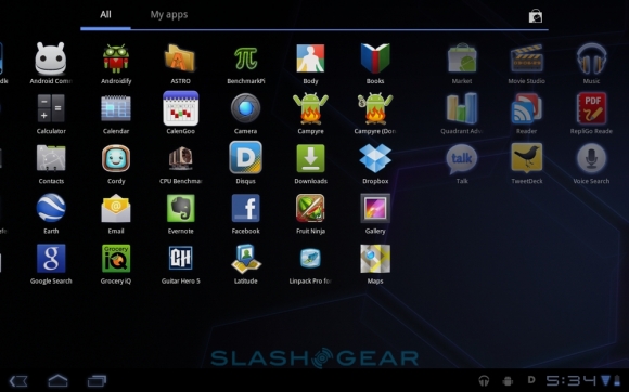
Applications themselves are one of the core components of these mobile operating systems, with the ability to download them through an open market — something that is not uncommon in these times. And Google has learned a lot from Apple’s experience in their iTunes store to implement and improve on their Android Market. Apps written for older versions of Android will still work in Honeycomb. The real question here is that how will an app built for a smaller smartphone screen translate to a bigger tablet one? Google is hoping that upon their release of the Honeycomb SDK, developers can tweak their current apps to work better in a tablet environment.

So how does Honeycomb stock up against the competition and how will it hold up once Apple unveils their iPad 2 in just a few days? Find that in the comprehensive review of Honeycomb from the great people at SlashGear.


0 comments:
Post a Comment